Design System
6 Months of hard work in a Design System

Links
What is an Atomic Design System?
Think of it like building a UI the way nature builds stuff. Starting from atoms and going all the way to full pages. Brad Frost coined this concept, breaking UI into 5 levels : atoms, molecules, organisms, templates, and pages.
Why it matters?
It keeps your designs clean, consistent, and easy to scale. Plus, devs love it because it makes components super reusable. In short — less chaos, more clarity, faster shipping
Color Primitives
These are the foundational colors in the palette. Think of them as the pure color values that serve as the core, supporting other color groups

Color Mode
Colors assigned for specific use cases, like buttons, text, or backgrounds. Each mode is tailored for a particular function to keep design consistent.
Typography

Spacing System
Effects
Corner Radius
Breakpoints
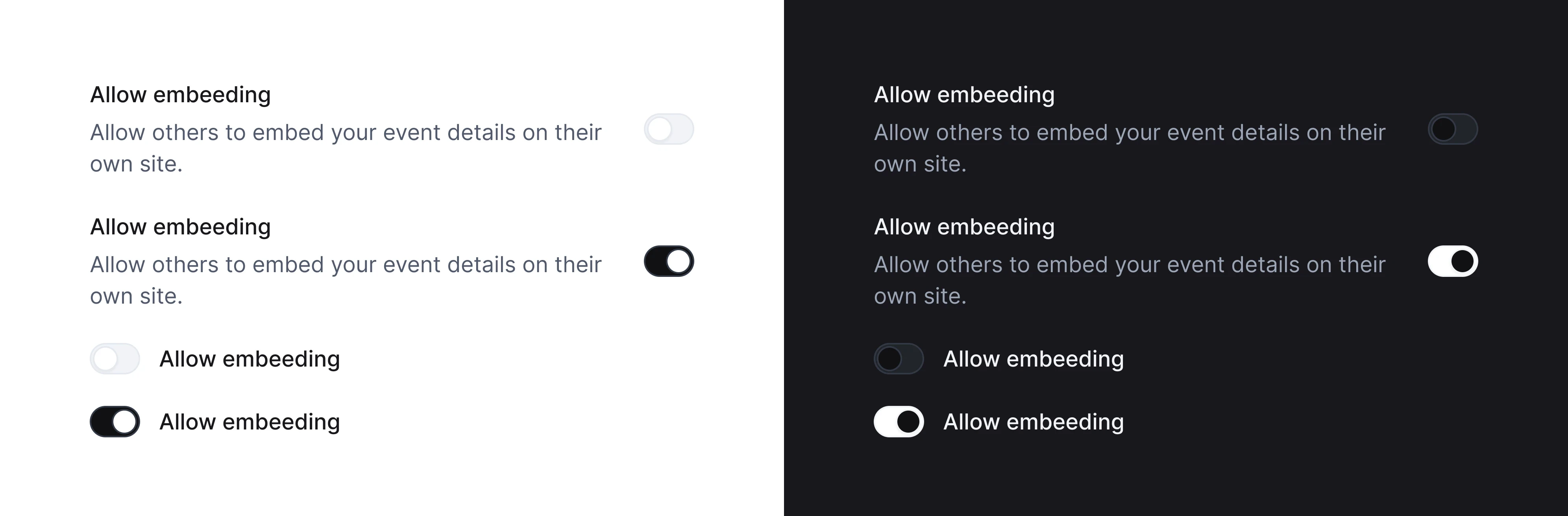
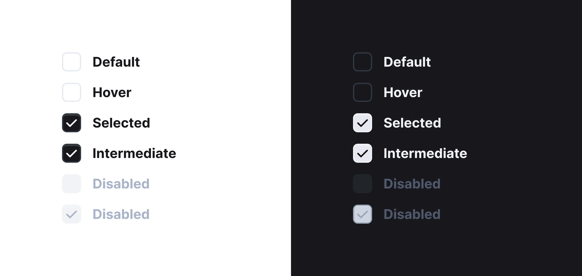
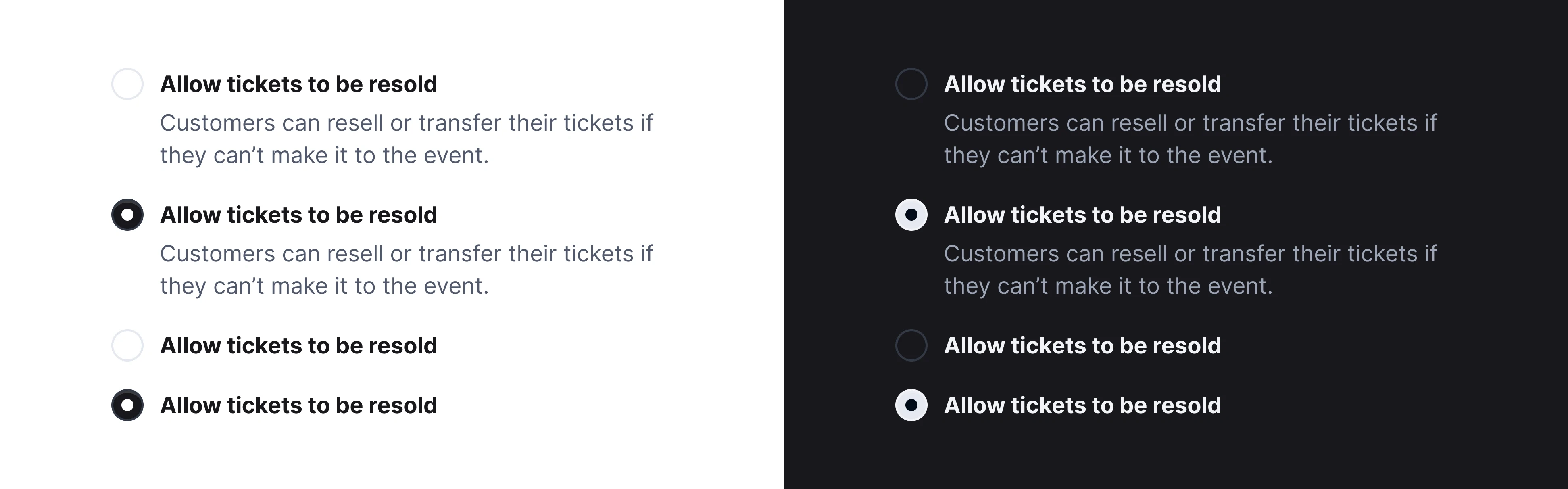
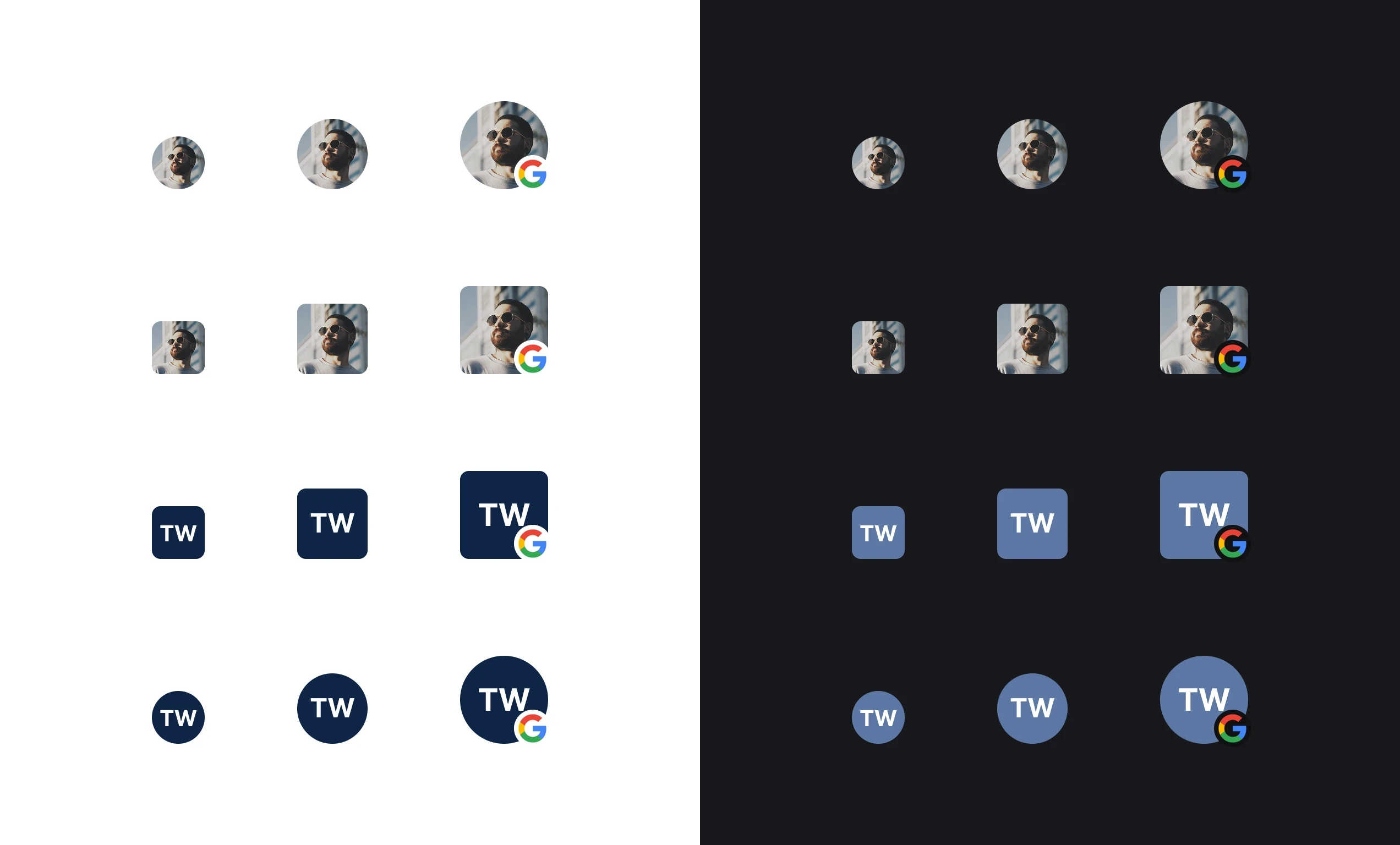
Atoms
Atoms are the smallest building blocks in a design system single, self-contained UI elements that can’t be broken down any further without losing their meaning.
Badge
Buttons
Toggle/Switch
Checkbox
Radio Button
Avatar
Progress Indicator
Chips
Tool Tips
Slider
Molecules
If atoms are single-purpose UI bits, molecules are **small groups of atoms working together to do one clear job, **think of them as functional mini-components you can drop anywhere.
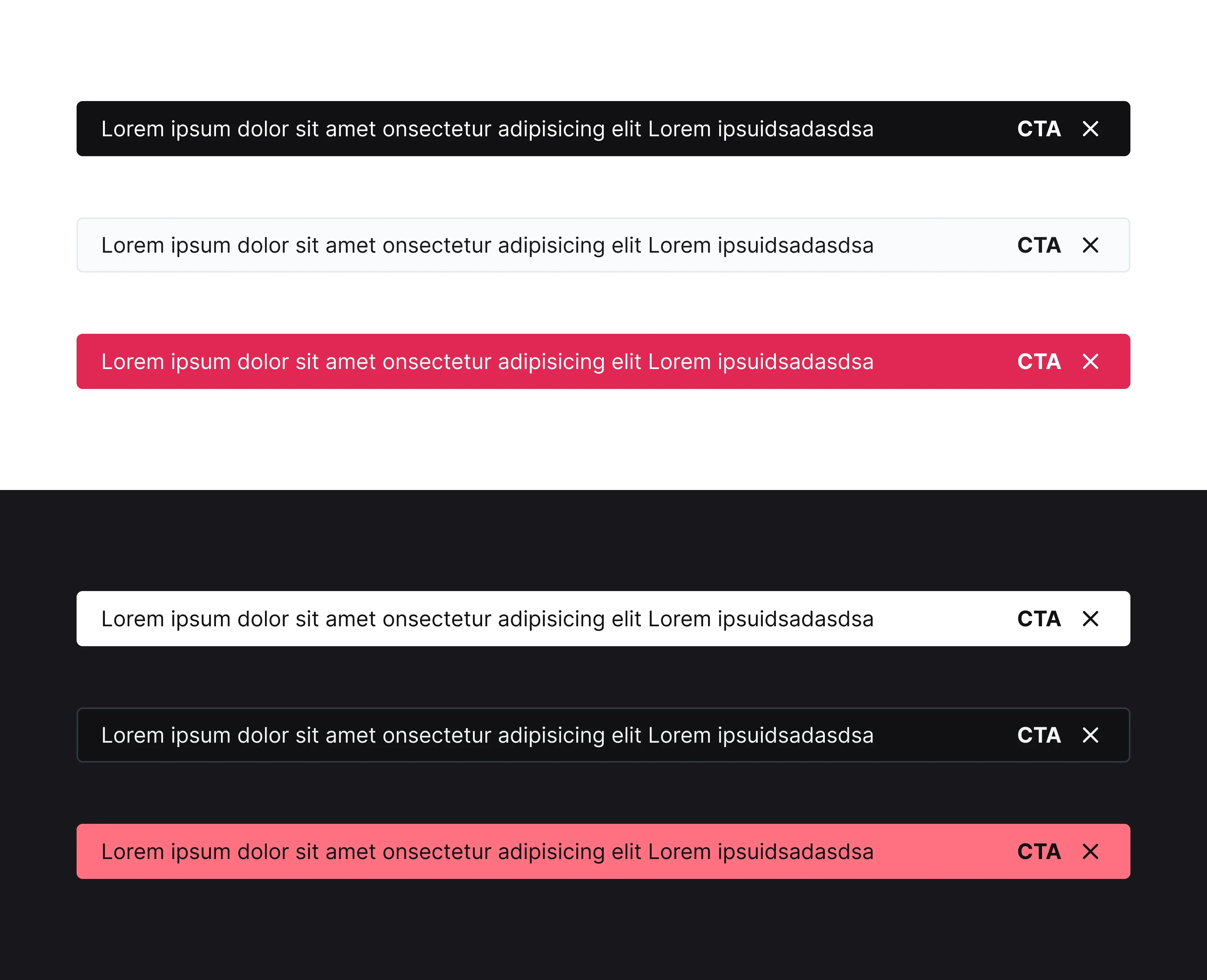
Toaster
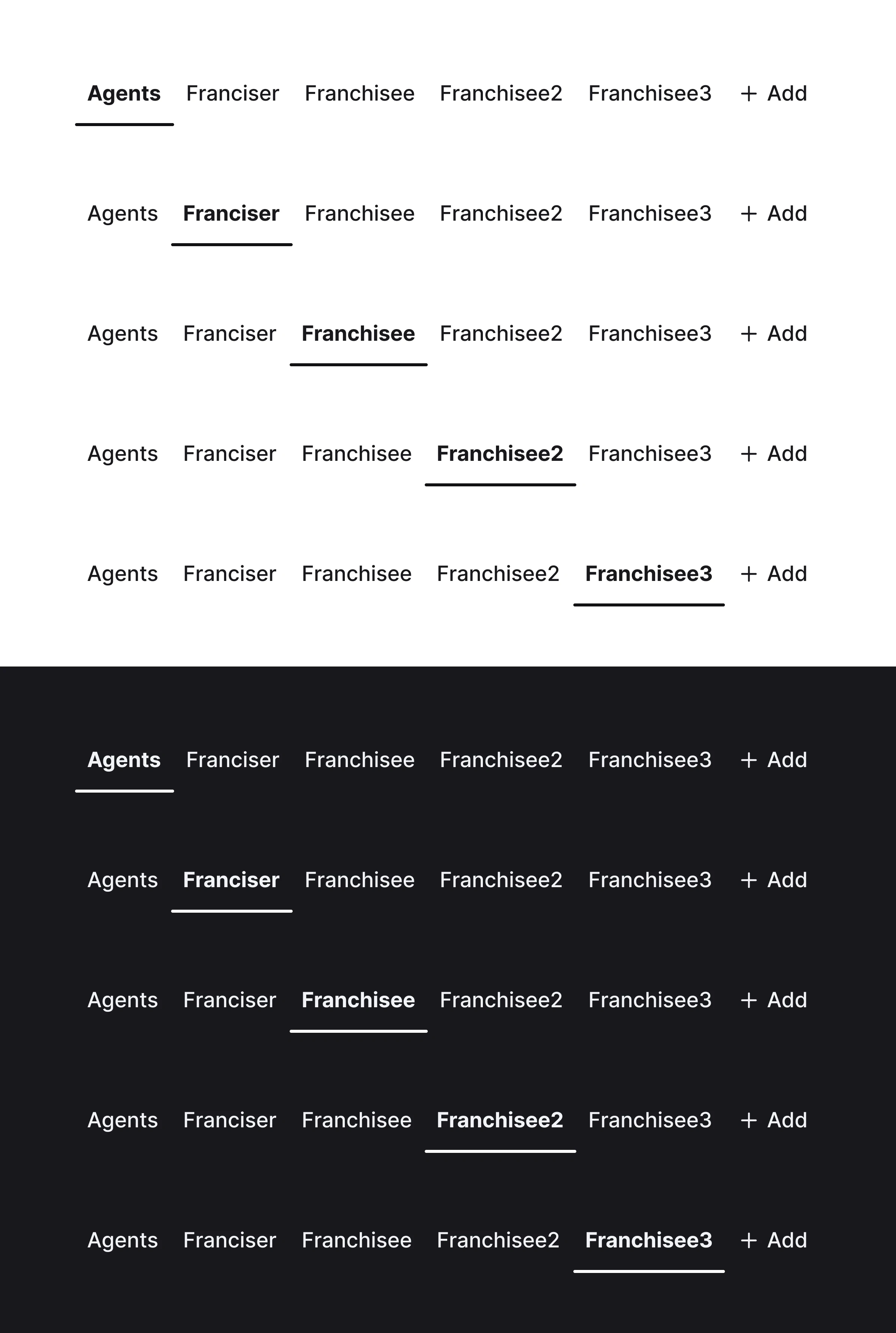
Tabs
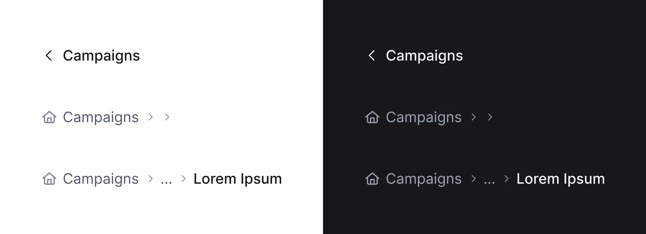
Breadcrumbs
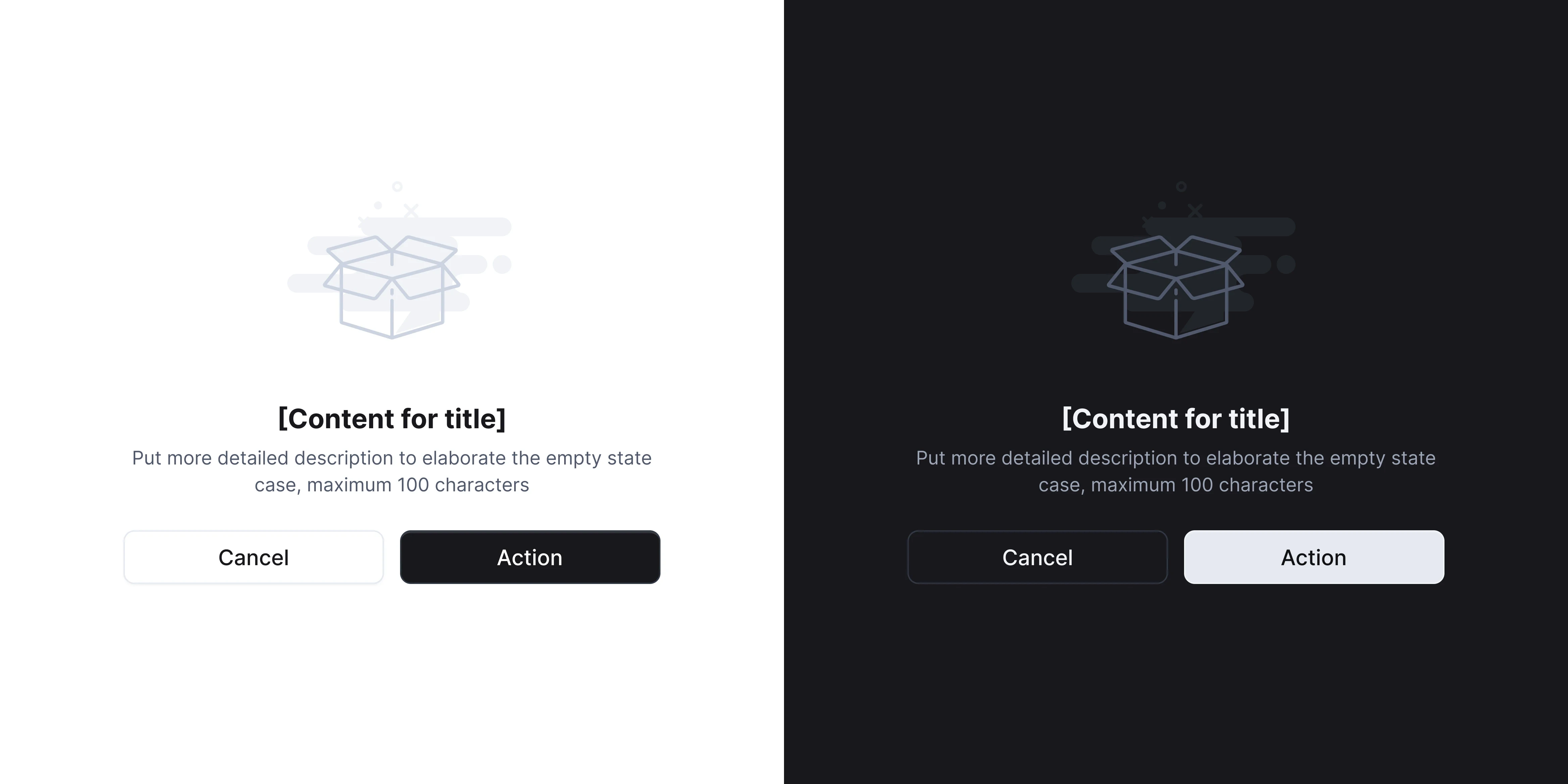
Empty States
Pagination
Dropdown
Dialog
Date Picker
Input
Search Bar
Filter
Text Area
Tables
Skelton Loader
Upload FIle
OTP
Notification Floating
Alert

Top Navigation
Slider Navigation
Client Testimonial